Plotting
cartoboost.plotting turns fitted model outputs, forecast artifacts, and
benchmark metric rows into Matplotlib figures. It is separate from model
fitting: the plots consume predictions and metrics that were already computed
by CartoBoost, the CLI, or an external baseline.
The API covers forecast component, uncertainty, and model-comparison diagnostics for CartoBoost benchmark evidence:
| Diagnostic need | CartoBoost plotting helper |
|---|---|
| Forecast line with uncertainty | plot_forecast |
| Forecast components | plot_forecast_components |
| Seasonality curve | plot_seasonality_curve |
| Changepoint markers | plot_forecast(..., changepoints=...) |
| Changepoint magnitudes | plot_changepoint_effects |
| Cross-validation metric curve | plot_horizon_metrics or plot_backtest_metrics |
| Cross-validation predictions by cutoff | plot_cutoff_predictions |
| Interval calibration | plot_interval_calibration |
| Model comparison | plot_metric_comparison |
| Reusable plot bundle | write_plot_report |
| Browser-local tree and splitter inspection | Modeling Lab |
Browser model visualizer
The Modeling Lab is separate from cartoboost.plotting: it
runs forecasting, regression, and neural examples in the browser, then asks for
opt-in diagnostics from that same fit. For
piecewise_linear_seasonal, the browser request uses Prophet-style modeling
aliases such as nChangepoints, changepointPriorScale,
seasonalityPriorScale, holidaysPriorScale, seasonalityMode,
holidaysMode, intervalWidth, and Prophet-shaped holidays rows. The
request also includes component and historical component payloads and renders a
Prophet-style debugger with forecast trend plus every numeric seasonal, event,
regressor, and custom component returned by the browser model. The same panel
renders historical actual, fitted, trend, seasonality, trend-movement,
fitted-movement, and residual plots from historyComponents. For regression and
neural surfaces, the visualizer renders a splitter atlas, boosted-tree
blueprints, split-kind mix, top splitter rules, depth profile, and largest
holdout residuals.
Use the built-in demo buttons to load either bundled browser sample. The 5,000-row single-series demand sample is shaped for forecasting demos: one continuous hourly target and enough history for roster comparisons without changing the forecast task into a panel problem. The 2,500-row varied-route sample keeps many coordinates and IDs for spatial, graph, neural, and splitter-visualization checks.
The Lab also renders direct spatial regions from uploaded data. A column named
for H3 or S2 is decoded into its cell boundary, while a geojson column accepts
Polygon, MultiPolygon, Feature, or FeatureCollection values. Each distinct
region is aggregated against the selected numeric target and can be inspected
as a flat colored surface or a 3D extrusion. H3 values may be standard hex or
decimal cell IDs; S2 values may be canonical decimal IDs, 0x-prefixed IDs, or
compact hexadecimal tokens. Invalid spatial values are reported instead of
being replaced with approximate point markers.
Visualization metadata is requested only by the Modeling Lab. Main browser forecasting, regression, and neural prediction calls continue without historical component payloads or tree traversal unless a caller explicitly asks for those debugger fields.
Prophet plotting parity
CartoBoost also exposes a local Prophet-compatible plotting surface for
PiecewiseLinearSeasonalForecaster reports and other Prophet-shaped artifacts.
The parity target is the public prophet.plot API from the package resolved by
CartoBoost's benchmark dependency range prophet>=1.1,<1.3: prophet==1.2.2.
That upstream module exposes these public plotting utilities, and CartoBoost
implements the same names in cartoboost.plotting:
Upstream prophet.plot utility | Local cartoboost.plotting utility | Purpose |
|---|---|---|
plot | plot | Observed points, yhat, optional intervals, capacity, floor, and legend. |
plot_components | plot_components | Trend, holidays, seasonalities, and extra regressor panels. |
plot_forecast_component | plot_forecast_component | One forecast component with optional uncertainty and cap/floor overlays. |
seasonality_plot_df | seasonality_plot_df | Builds the temporary seasonality dataframe with neutral caps, floors, regressors, and active conditions. |
plot_weekly | plot_weekly | Sunday-start weekly seasonality curve with weekly_start. |
plot_yearly | plot_yearly | Jan. 1-start yearly seasonality curve with yearly_start. |
plot_seasonality | plot_seasonality | Generic periodic seasonality curve for daily, weekly, yearly, or custom periods. |
set_y_as_percent | set_y_as_percent | Percent-formats multiplicative component axes. |
add_changepoints_to_plot | add_changepoints_to_plot | Adds significant changepoint markers based on mean delta magnitude. |
plot_cross_validation_metric | plot_cross_validation_metric | Horizon metric scatter plus rolling aggregate for mse, rmse, mae, mape, mdape, smape, or coverage. |
plot_plotly | plot_plotly | Interactive forecast figure with optional trend and changepoints. |
plot_components_plotly | plot_components_plotly | Interactive component subplot figure. |
plot_forecast_component_plotly | plot_forecast_component_plotly | Interactive single-component figure. |
plot_seasonality_plotly | plot_seasonality_plotly | Interactive single-seasonality figure. |
get_forecast_component_plotly_props | get_forecast_component_plotly_props | Plotly trace and axis props for one forecast component. |
get_seasonality_plotly_props | get_seasonality_plotly_props | Plotly trace and axis props for one seasonality. |
The compatibility tests in tests/python/test_plotting.py lock this list as
PROPHET_PLOT_122_PUBLIC_UTILITIES and lock the exact parameter/default
surface as PROPHET_PLOT_122_SIGNATURES. They also render representative
Matplotlib and Plotly figures from a Prophet-shaped local model. Those tests
prove the local module has the same public plotting utility names and call
signatures as prophet==1.2.2, and that the helpers operate on the same
forecast columns and model attributes (history, seasonalities,
extra_regressors, component_modes, changepoints, params["delta"], and
predict_seasonal_components).
The plotting helpers can be used directly or through the reusable
cartoboost.Prophet façade. The façade delegates fitting and prediction to the
Rust-native PiecewiseLinearSeasonalForecaster while preserving Prophet's
ds/y dataframe ergonomics.
The forecast plot follows the installed prophet.plot.plot behavior:
| Element | Behavior matched by cartoboost.plotting.plot |
|---|---|
| Observations | m.history["ds"] and m.history["y"] drawn as black points. |
| Forecast | fcst["ds"] and fcst["yhat"] drawn as a solid forecast line. |
| Capacity | fcst["cap"] drawn as a dashed line only when plot_cap=True. |
| Floor | fcst["floor"] drawn only when m.logistic_floor, plot_cap=True, and the column exists. |
| Interval | yhat_lower / yhat_upper filled only when uncertainty=True and m.uncertainty_samples is nonzero. |
| Axes | Prophet date formatting, grid, xlabel="ds", ylabel="y", and legend only when include_legend=True. |
No fallback model attributes are supplied in the plotting layer. A caller must provide a Prophet-shaped object with the same attributes Prophet expects.
from types import SimpleNamespace

import pandas as pd

from cartoboost.plotting import plot, save_figure

history = pd.DataFrame(
    {
        "ds": pd.to_datetime(holdout_rows["pickup_date"]),
        "y": holdout_rows["actual_loads"],
    }
)
forecast = pd.DataFrame(
    {
        "ds": pd.to_datetime(holdout_rows["pickup_date"]),
        "yhat": holdout_rows["cartoboost_auto_forecast"],
    }
)

prophet_like_model = SimpleNamespace(
    history=history,
    logistic_floor=False,
    uncertainty_samples=0,
)

fig = plot(prophet_like_model, forecast)
save_figure(fig, "target/plots/prophet_forecast_pu237_do236.png", close=True)
Prophet's forecast plot is single-series. For panel reviews, render one Prophet-shaped figure per entity rather than mixing unrelated rows into one axis.
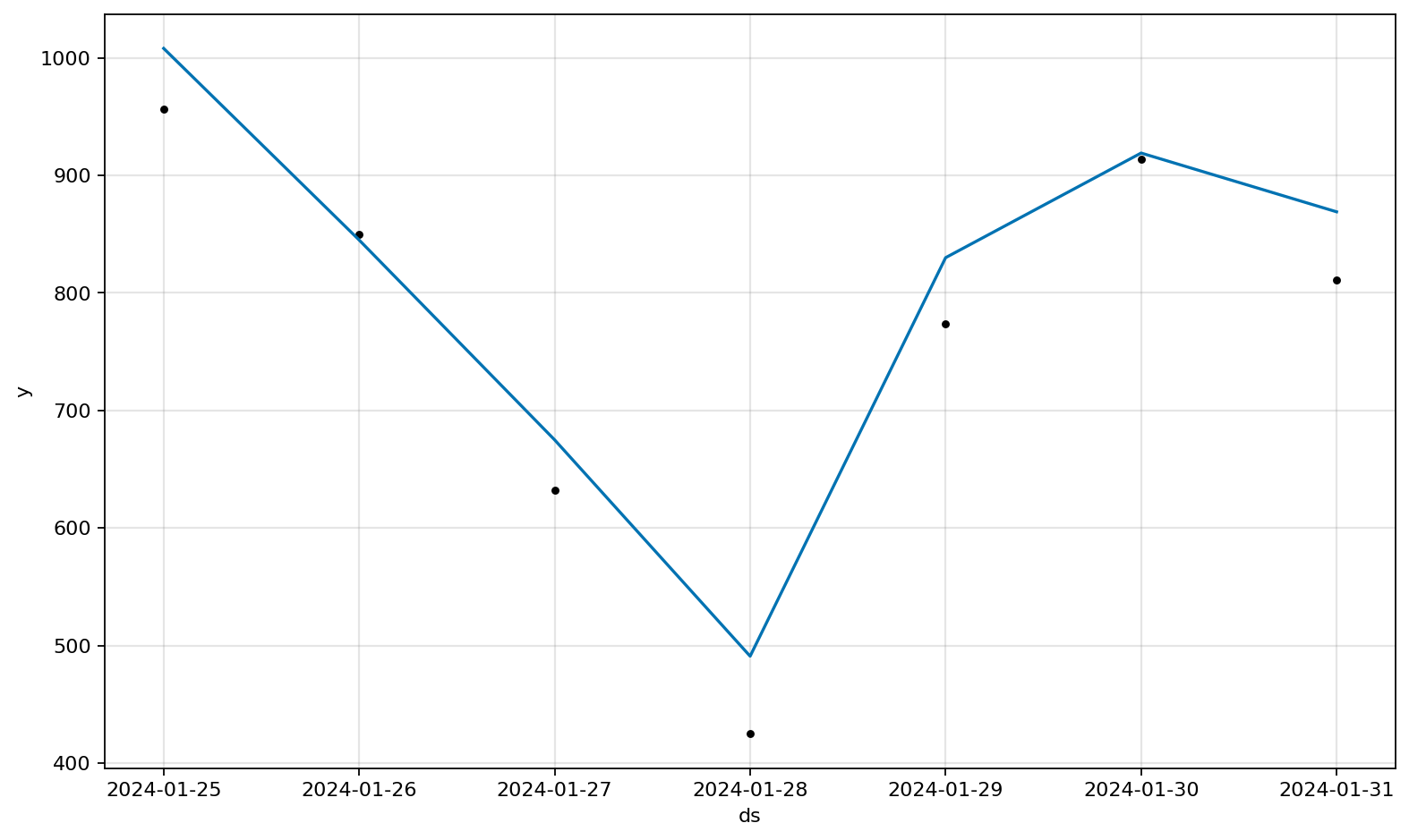
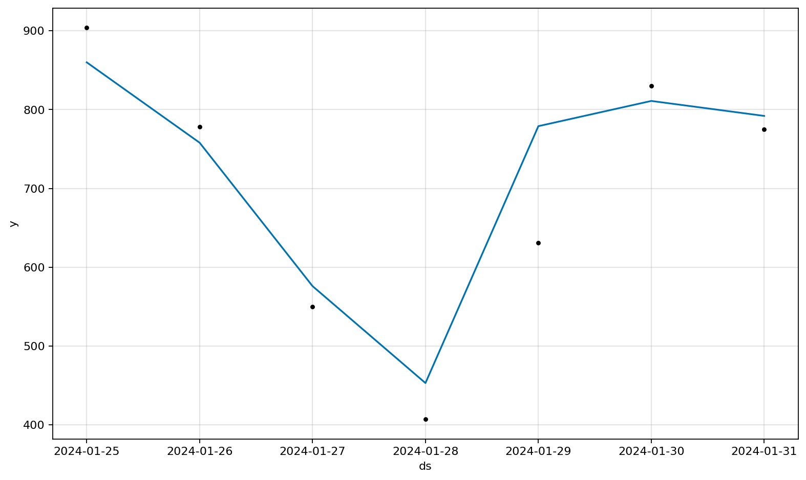
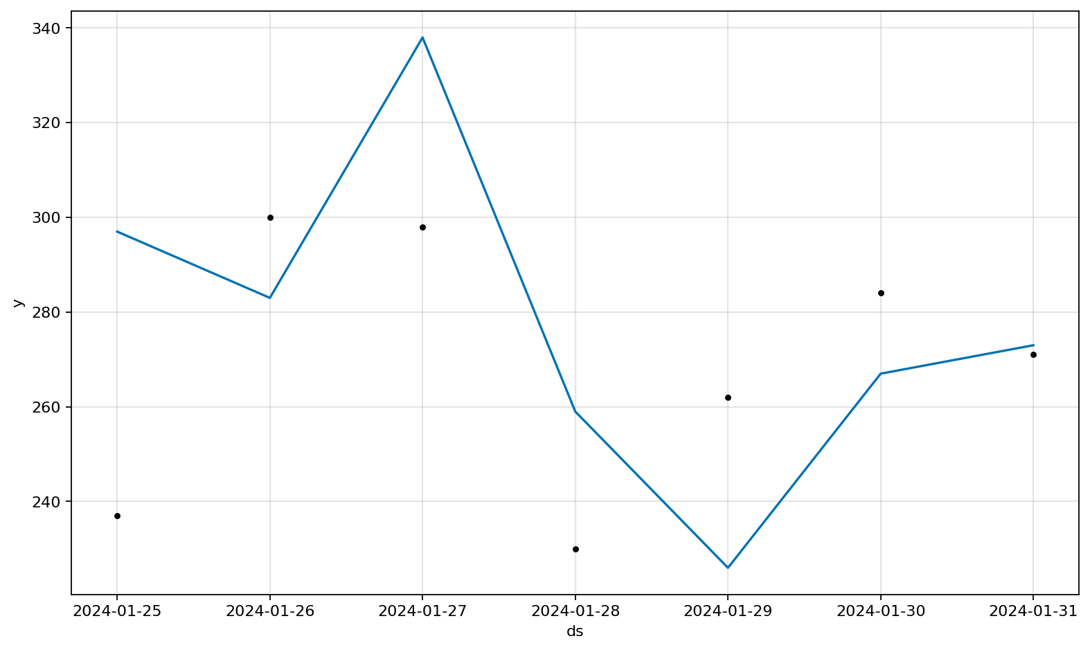
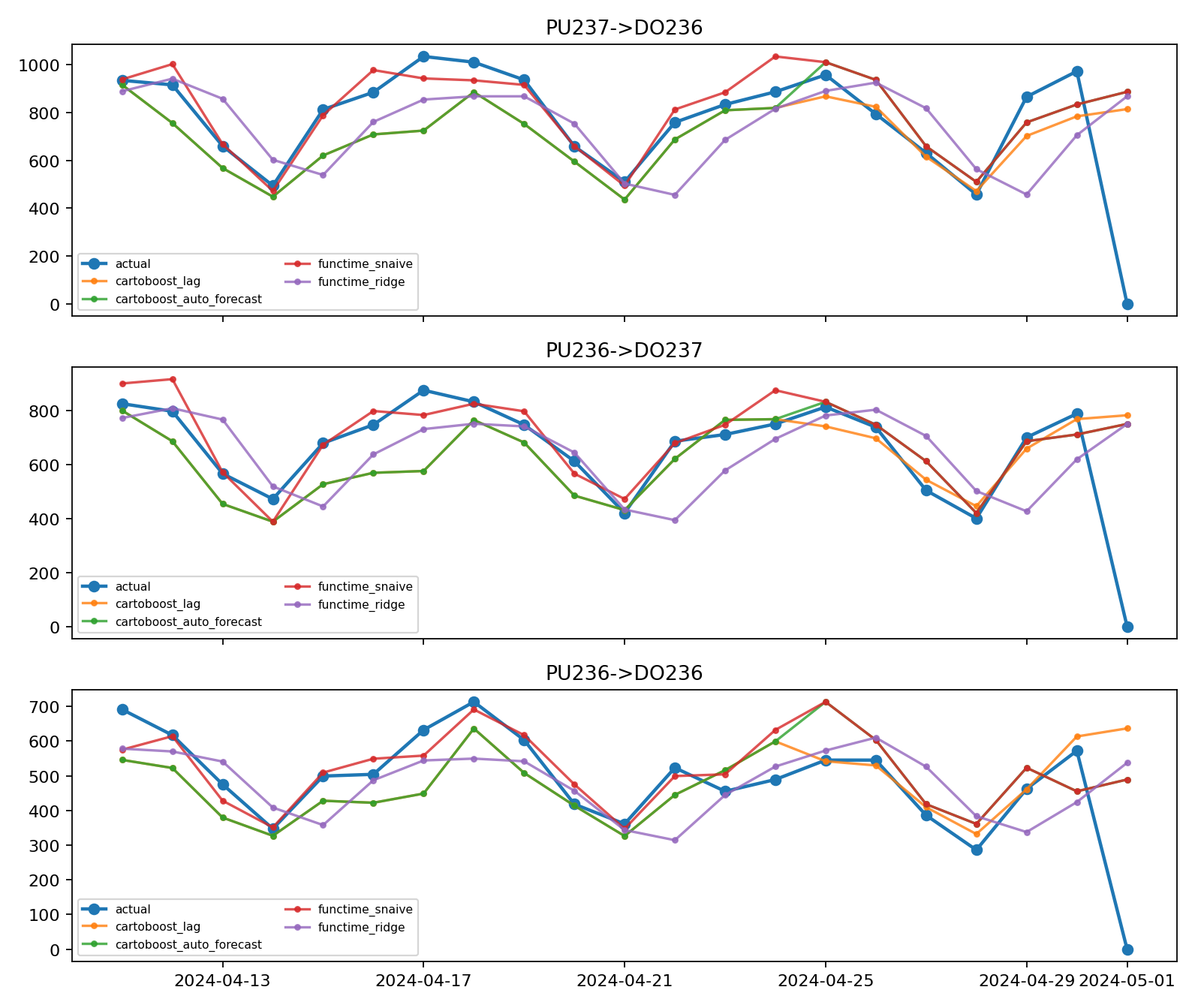
These images were generated from the maintained NYC benchmark holdout with:
uv run --no-sync --group dev --group bench python scripts/forecasting_library_benchmark.py \
  --source nyc-taxi \
  --year 2024 \
  --months 1 \
  --taxi-type yellow \
  --lanes 24 \
  --horizon 7 \
  --no-download \
  --no-hyperopt \
  --model-roster cartoboost \
  --output docs/assets/nyc_taxi_benchmarks/forecasting_library_benchmark_real.json \
  --plot-dir docs/assets/nyc_taxi_benchmarks/forecasting_plots
Install the optional visualization dependency when using these helpers outside the development environment:
uv add geopandas matplotlib pydeck shapely
Regression diagnostics
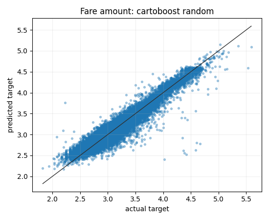
Use plot_predicted_actual and plot_residual_diagnostics after scoring the
same held-out rows across CartoBoost and baselines.
from cartoboost import CartoBoostRegressor
from cartoboost.plotting import (
    plot_predicted_actual,
    plot_residual_diagnostics,
    save_figure,
)

model = CartoBoostRegressor(n_estimators=80, random_state=7)
model.fit(train_features, train_fare)
predicted_fare = model.predict(test_features)

fig = plot_predicted_actual(
    test_fare,
    predicted_fare,
    title="CartoBoost fare holdout: predicted vs actual",
    xlabel="Actual fare",
    ylabel="Predicted fare",
)
save_figure(fig, "target/plots/cartoboost_fare_predicted_actual.png", close=True)

fig = plot_residual_diagnostics(
    test_fare,
    predicted_fare,
    title="CartoBoost fare holdout residual diagnostics",
)
save_figure(fig, "target/plots/cartoboost_fare_residuals.png", close=True)
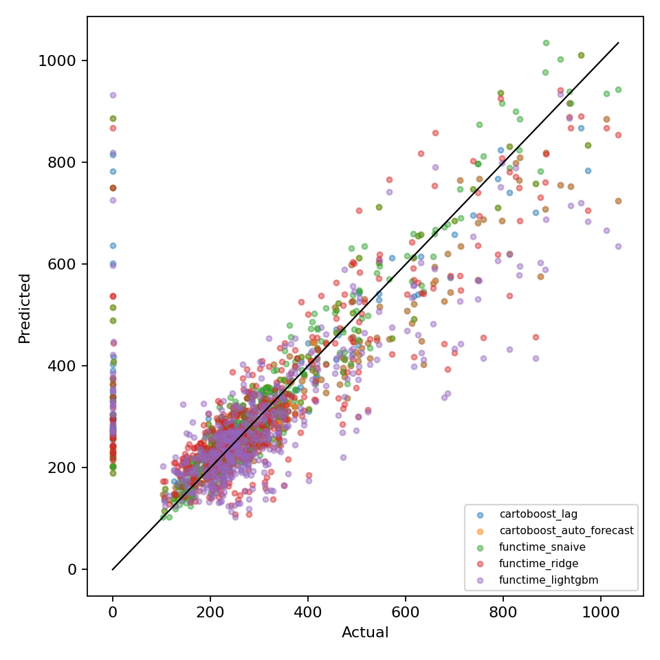
The scatter plot includes a parity line. The residual diagnostic figure shows residuals by prediction and the residual distribution, which makes bias, heteroskedasticity, and outlier-heavy rows easier to spot than a metric table alone.
Rendered benchmark examples from the maintained NYC benchmark:

Model metric comparisons
plot_metric_comparison accepts a list of dictionaries, a dict of columns, or a
dataframe-like object with to_dict. Keep the rows tied to one split and one
metric definition.
from cartoboost.plotting import plot_metric_comparison, save_figure

rows = [
    {"model": "cartoboost", "rmse": 4.12, "mae": 2.18},
    {"model": "lightgbm", "rmse": 4.35, "mae": 2.31},
    {"model": "xgboost", "rmse": 4.41, "mae": 2.36},
    {"model": "mean", "rmse": 8.90, "mae": 6.44},
]

fig = plot_metric_comparison(
    rows,
    metric="rmse",
    title="CartoBoost duration holdout RMSE",
    ylabel="RMSE minutes",
)
save_figure(fig, "target/plots/cartoboost_duration_rmse.png", close=True)
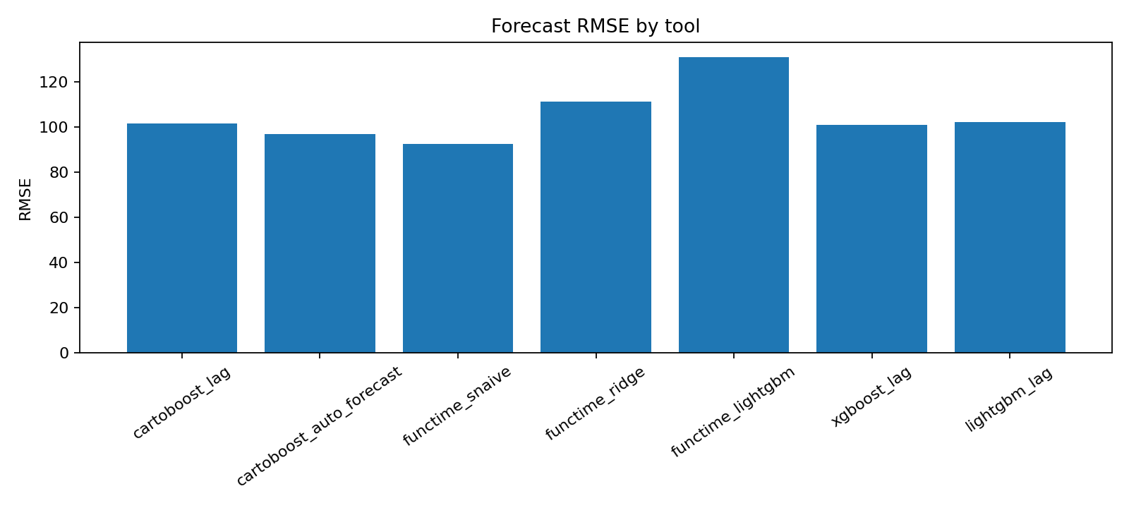
The default sort places the lowest metric value first, which matches RMSE, MAE, WAPE, and most loss-style benchmark tables.
Rendered benchmark metric comparison:

Forecast plots
plot_forecast renders historical observations, forecast points, optional
holdout actuals, optional lower/upper bounds from forecast rows, and optional
changepoint markers.
from cartoboost.forecasting import ForecastArtifact
from cartoboost.plotting import plot_forecast, save_figure

artifact = ForecastArtifact.load("target/forecast-artifacts/demand")

fig = plot_forecast(
    artifact.forecast,
    history=history_rows,
    time_col="timestamp",
    actual_col="demand",
    prediction_col="prediction",
    lower_col="lower_90",
    upper_col="upper_90",
    series_id="zone_132",
    changepoints=["2026-03-01", "2026-04-15"],
    title="Pickup demand forecast",
)
save_figure(fig, "target/plots/zone_132_forecast.png", close=True)
For panel forecasts, pass series_id and series_id_col to focus the chart on
one entity, route, or lane. If interval columns are present, the function
validates that every lower value is less than or equal to its upper value before
drawing the band.
Rendered benchmark forecast examples:
Forecast components
plot_forecast_components handles component diagnostics without coupling the
chart to one model. Pass any numeric component columns emitted by a CartoBoost
artifact, benchmark harness, or external baseline.
from cartoboost.plotting import plot_forecast_components, save_figure

component_rows = [
    {
        "series_id": "zone_132",
        "timestamp": "2026-03-01",
        "trend": 120.0,
        "weekly": -8.0,
        "event": 0.0,
    },
    {
        "series_id": "zone_132",
        "timestamp": "2026-03-02",
        "trend": 122.0,
        "weekly": 6.0,
        "event": 4.0,
    },
]

fig = plot_forecast_components(
    component_rows,
    component_cols=["trend", "weekly", "event"],
    series_id="zone_132",
    changepoints=["2026-03-01"],
    title="Pickup demand forecast components",
)
save_figure(fig, "target/plots/zone_132_components.png", close=True)
If component_cols is omitted, the helper infers numeric columns while skipping
standard forecast identifiers, predictions, and interval bounds. Explicit
columns are preferred for benchmark evidence because they keep component order
stable across reruns.
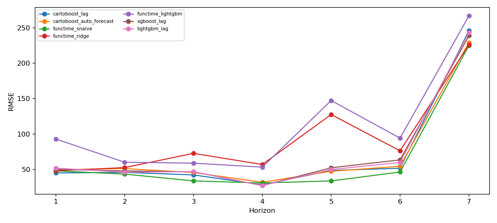
For component-style forecast reports, pair this plot with the forecast-line and horizon diagnostics so trend, seasonality, and holdout error are read together:
plot_seasonality_curve focuses on one or more periodic curves and supports
optional lower/upper bands.
from cartoboost.plotting import plot_seasonality_curve, save_figure

seasonality_rows = [
    {"component": "weekly", "phase": 0, "value": -8.0, "lower": -10.0, "upper": -6.0},
    {"component": "weekly", "phase": 1, "value": 6.0, "lower": 4.0, "upper": 8.0},
    {"component": "weekly", "phase": 2, "value": 4.5, "lower": 2.5, "upper": 6.5},
]

fig = plot_seasonality_curve(
    seasonality_rows,
    x_col="phase",
    value_col="value",
    lower_col="lower",
    upper_col="upper",
    label_col="component",
    title="Pickup demand weekly seasonality",
    xlabel="Day of week",
    ylabel="Pickup count effect",
)
save_figure(fig, "target/plots/pickup_weekly_seasonality.png", close=True)
plot_changepoint_effects complements forecast-level changepoint markers with
signed effect sizes.
from cartoboost.plotting import plot_changepoint_effects, save_figure

changepoint_rows = [
    {"timestamp": "2026-03-01", "delta": 14.2},
    {"timestamp": "2026-04-15", "delta": -9.1},
]

fig = plot_changepoint_effects(
    changepoint_rows,
    time_col="timestamp",
    delta_col="delta",
    title="Pickup demand changepoint effects",
)
save_figure(fig, "target/plots/pickup_changepoints.png", close=True)
For Prophet-style demand reviews, render changepoints alongside forecast lines and component panels so step changes are visible in the same report.
Horizon metrics
plot_horizon_metrics compares forecast quality over horizon for one or more
models.
from cartoboost.plotting import plot_horizon_metrics, save_figure

horizon_rows = [
    {"model": "cartoboost_lag", "horizon": 1, "rmse": 11.2},
    {"model": "cartoboost_lag", "horizon": 2, "rmse": 12.5},
    {"model": "seasonal_naive", "horizon": 1, "rmse": 13.8},
    {"model": "seasonal_naive", "horizon": 2, "rmse": 14.7},
]

fig = plot_horizon_metrics(
    horizon_rows,
    metric_col="rmse",
    title="Pickup demand RMSE by forecast horizon",
)
save_figure(fig, "target/plots/pickup_demand_horizon_rmse.png", close=True)
Use this chart next to rolling-origin metric tables when a model wins on short horizons but loses as the demand forecast moves further from the cutoff.
Rendered horizon metric example:
Backtest and interval diagnostics
plot_backtest_metrics shows whether a model win is stable across validation
folds or depends on one unusually easy cutoff.
from cartoboost.plotting import plot_backtest_metrics, save_figure

fold_rows = [
    {"model": "cartoboost_lag", "fold": 1, "rmse": 11.2},
    {"model": "cartoboost_lag", "fold": 2, "rmse": 12.8},
    {"model": "seasonal_naive", "fold": 1, "rmse": 13.8},
    {"model": "seasonal_naive", "fold": 2, "rmse": 14.1},
]

fig = plot_backtest_metrics(
    fold_rows,
    metric_col="rmse",
    title="Pickup demand rolling-origin RMSE",
)
save_figure(fig, "target/plots/pickup_demand_backtest_rmse.png", close=True)
plot_interval_calibration compares requested interval coverage with observed
coverage and, when available, shows mean interval width. Use it when reporting
probabilistic forecasts or conformal intervals.
from cartoboost.plotting import plot_interval_calibration, save_figure

interval_rows = [
    {"nominal_coverage": 0.5, "coverage": 0.48, "mean_width": 18.2},
    {"nominal_coverage": 0.8, "coverage": 0.78, "mean_width": 31.5},
    {"nominal_coverage": 0.9, "coverage": 0.88, "mean_width": 39.7},
]

fig = plot_interval_calibration(
    interval_rows,
    title="Pickup demand interval calibration",
)
save_figure(fig, "target/plots/pickup_demand_interval_calibration.png", close=True)
Coverage values are validated as probabilities between 0 and 1. The diagonal line marks perfectly calibrated intervals; points below it indicate under-coverage on the evaluated demand rows.
For a maintained forecast report, put interval calibration next to the same model-comparison image used for point metrics:
plot_cutoff_predictions overlays actual holdout values with the predictions
emitted from each validation cutoff. This is useful when a rolling-origin metric
curve needs a row-level explanation.
from cartoboost.plotting import plot_cutoff_predictions, save_figure

cutoff_rows = [
    {"cutoff": "2026-03-01", "timestamp": "2026-03-02", "actual": 180, "prediction": 176},
    {"cutoff": "2026-03-01", "timestamp": "2026-03-03", "actual": 191, "prediction": 188},
    {"cutoff": "2026-03-08", "timestamp": "2026-03-09", "actual": 204, "prediction": 199},
]

fig = plot_cutoff_predictions(
    cutoff_rows,
    actual_col="actual",
    prediction_col="prediction",
    title="Pickup demand rolling-origin predictions",
)
save_figure(fig, "target/plots/pickup_cutoff_predictions.png", close=True)
The rendered forecast-line image shows the same idea at report scale: actual demand remains visible while model forecasts are overlaid by horizon.
Diagnostic reports
write_plot_report writes a standard bundle of diagnostics and returns a
manifest-style dictionary of plot names to paths. This is useful for benchmark
runs where every model or split should emit the same evidence set.
from cartoboost.plotting import write_plot_report

plots = write_plot_report(
    "target/plots/fare_holdout",
    predicted_actual=(test_fare, predicted_fare),
    metric_rows=[
        {"model": "cartoboost", "rmse": 4.12},
        {"model": "lightgbm", "rmse": 4.35},
        {"model": "mean", "rmse": 8.90},
    ],
    prefix="cartoboost_fare",
)

print(plots["predicted_actual"])
print(plots["residual_diagnostics"])
print(plots["metric_comparison"])
The report writer deliberately skips inputs that are not provided. Pass forecast rows, component rows, horizon rows, backtest rows, or interval rows to add those figures to the same directory. Pass seasonality, changepoint, or cutoff rows to include component and validation diagnostics in the same bundle.
Rendered report bundles should include both quality and speed views when the claim compares model families:

Map visualizations
The same visualization packages also enable map-focused diagnostics for rows with coordinates. Static maps use GeoPandas and Shapely; interactive maps use PyDeck. These packages are optional and loaded only when a map helper is called.
from cartoboost.plotting import (
    plot_route_segments,
    plot_spatial_points,
    save_figure,
    write_pydeck_point_map,
)

pickup_rows = [
    {"latitude": 40.644, "longitude": -73.782, "point_count": 184},
    {"latitude": 40.758, "longitude": -73.985, "point_count": 96},
]

fig = plot_spatial_points(
    pickup_rows,
    latitude_col="latitude",
    longitude_col="longitude",
    value_col="point_count",
    title="Pickup demand by zone centroid",
)
save_figure(fig, "target/plots/pickup_centroids.png", close=True)

route_rows = [
    {
        "pickup_latitude": 40.644,
        "pickup_longitude": -73.782,
        "dropoff_latitude": 40.758,
        "dropoff_longitude": -73.985,
        "fare": 54.2,
    }
]

fig = plot_route_segments(route_rows, value_col="fare", title="CartoBoost fare by route")
save_figure(fig, "target/plots/fare_routes.png", close=True)

write_pydeck_point_map(
    pickup_rows,
    "target/plots/pickup_centroids.html",
    value_col="point_count",
    tooltip_cols=["point_count"],
)
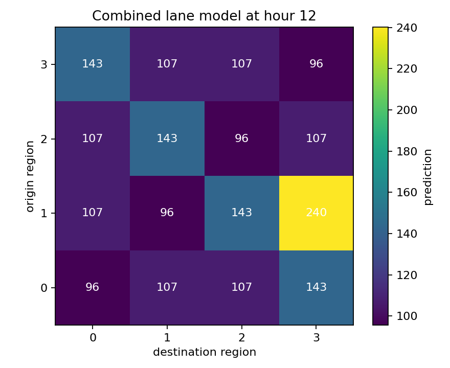
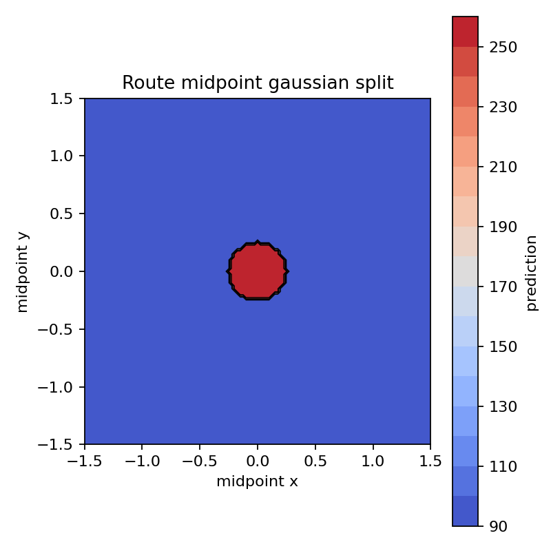
Rendered static route and zone diagnostics:
If the optional packages are missing, map helpers raise an ImportError with
the install command:
uv add geopandas matplotlib pydeck shapely
Saving figures
All plotting helpers return a Matplotlib Figure. save_figure creates parent
directories, writes the file with a stable default DPI, and can close the figure
after writing:
from cartoboost.plotting import save_figure

save_figure(fig, "target/plots/chart.png", dpi=180, close=True)
Prefer target/ for exploratory plots. Commit generated plots only when they
are part of a maintained benchmark artifact and the benchmark documentation
identifies the command and source data that produced them.